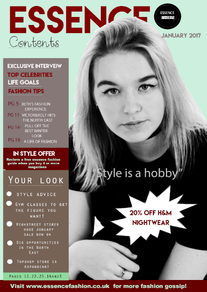
This is the final outcome for my contents page. I feel it has many contrasting affects through the use of colour and textures.
To begin with, I have used a black and white main image, i done this using a 'filter' on photoshop. Then gradually increasing the brightness and contrast levels, as well as darkening darker areas and lightning whiter colours, using the 'curves' and 'levels' tool. This idea of using black and white against coloured features, allows the magazine contents page to look both modern and traditional, allowing opposites to be created.
As for the main title, i have used a deep red font colour, connecting to the other features on the magazine. As well as a bold, upper case font, to represent and make the title eye catching.
Again, i have included the logo on the contents page, for the audience to recognise and to identity the magazine brand. The date notifies the reader that the magazine is up to date. This is something i have made repetitive, as i used it on my front cover.
The styles of fonts i have experimented with is wide. Using the website 'Dafont' to download the fonts into Photoshop. I downloaded the styles, 'Starfish', which i used for the word 'Contents'. This added a creative affect to the page, expressing the creativeness of the theme 'Fashion'. It also added a cursive and unique font, different to the others used.
The index includes many features and stories within the magazine and gives the reader an indication of what the magazine is about. moreover, The features of the index, include, offers, tips and stories of fashion, that may attract and engage the reader into reading the magazine. I have also added the page numbers of the stories and index features because this makes an easy access for the reader to flick to the page they want to read, rather than reading the whole magazine until they get to it. In addition, the colours i have used as a background for the index, are the colours grey and brown, this is because it contrasts with the background colour/ fill colour of the contents page. I used the colour shade, 'Maroon red' to highlight the more important information, in which, i wanted the audience to notice first.
Moreover, i chose to use the dame background colour for my contents page as i used for my front cover. This is because when pages are put together they look connected and are relative to each other. So, the audience can recognise the pages are from the same magazine and look professional.
The puff advertises discount on the fashion store, 'H&M'. This is an important source of information. So, in this case, i decided to use an eye grabbing feature for it. Using an upper case font style to grab attention.
In the banner at the bottom of the page, i have added the web address, which is an extra source of advertising for my magazine brand. I used a banner on the front cover as well and i i find this feature quite professional and it adds quality to the contents design. The typography contrasts with the deep red banner colour. So, it stands out and is noticeable.
Lastly, i have included the quotation, " Style is a hobby". This is a form of persuasive language as it is a quote which i will use in my double page spread article. So, it gives the audience an insight of the article inside the magazine. The language is brought across using a metaphor, as 'style' isn't a hobby. Although, using this term, makes the magazine exciting and fascinating. as well as unique.
Overall, i am happy with my contents page, as it gives a lot of information. However, it doesn't look overcrowded. So, i have thought in depth about the design of the page. I will continue onto my double page spread and consider colour tone, contrast, imagery, quotation and language, to make it appealing to the audience i am targeting my magazine to ( young females).
No comments:
Post a Comment