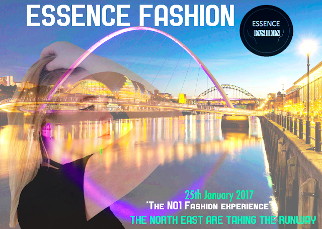
This is my final billboard result. I like how i have given the billboard a theme of 'Creativity', it allows the billboard to have a positive impact towards the audience, as the style is unique and blends textures and colour tones well.
I love the level of colour the billboard goes into it. For example, the yellow tones in the billboard, enlighten the exposure of the main image and text. Plus, the pink tones used as a reflection of the bridge in the background, regional image, increase the vibrancy of the design.
Using bold upper case font for the brand name/ title and the text at the bottom of the billboard, allows the typography to stand out and capture the audience's attention. As well as this, the colours i have selected for the font connect well with my magazine product, as the colour relates to the background of the magazine pages. So, the billboard looks a part of it. Furthermore, the white font contrasts and it eye catching against the dark colour of the background.
The idea of the billboard being creative links to the 'Fashion' theme of my product. So, this idea is expressed within the design of the billboard.
Lastly, the logo of 'Essence Fashion' is another feature that connects to my magazine because it allows the reader to recognise and come familiar with it, so that when they see the logo somewhere else, they know its 'Essence Fashion'.
The conclusion to my Billboard result, is that i like how it is unique and advertises an event within the North east. I feel this is a way of telling the audience the fashion company is regional in only the north east. I also like the style of image i have chosen, as it's composition is different to the other images i have used in my magazine. It's taken slightly to the side as a mid shot.
No comments:
Post a Comment