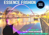
 Development of Billboard...
Creating the billboard is one of the easiest processes for my media product so far. This is because the billboard does not consist of as much information as the the magazine itself. The Billboard is more of an advertisement to persuade the audience to read the magazine or attend an event. In this case, for my billboard i am advertising a fashion event. This may persuade the audience buy an 'Essence magazine' to find out more about the event or look on the web page. The reason why the audience know that the billboard advertise 'Essence' is because i have used the logo, in which i repeated in the pages of my magazine, in order for the audience to get familiar with it.
To create my Billboard, i began by creating an A4 international paper sized layer like i did for my magazine. Although, i used the idea of creating my double page spread, by rotating the page 90 degrees. This allowed the billboard to be landscape rather than portrait. So, it looks official.
Continuing on from this, i found an image from google images, of the North east ( Newcastle bridge) that would advertise the regional idea of my magazine/ brand. Therefore, the reader does not mistaken the brand for being national. I done this by dragging the image into photoshop, selecting around the area with the 'rectangular marquee tool' and then using the 'edit copy, edit paste 'technique onto the layer i was working on. After this, i altered the opacity level of the image by altering the 'opacity percentage'. Changing it from 100% to 35%. I thought of this idea because i did not want the image to take the main focus away from the other features i intended to add to the billboard. Such as the main image and text. Also, because i wanted this image to be a background image.
Leading on from this, i then added the title 'Essence Fashion'. Using the font style 'Copper plate gothic Bold 'from the photoshop font, drop down list. The purpose of using this style of type, allows the text to stand out and be sharp and intense. So, it will be eye-catching to the potential target audience. I use the colour, 'White' from the 'colour chart' on photoshop. As this colour contrasts well with the blue sky colour of the background.
After this, i included my brand logo from my JPEG images pasting the image onto the Billboard layer and resizing it using the 'free transform tool' and holding down the 'shift key'.
The main image i chose is a wide shot with a different style of pose to the other images i have used in my product. Therefore, experimentation is proven using this technique. To use it on my billboard, i dragged the image into photoshop and using the 'Magnetic lasso tool', i selected around the model's figure, so i would not select any white background of the image, which i would need to erase when it is pasted to the billboard layer. Once the image was copied and pasted onto the layer, i again, used the 'free transform tool' to resize the image. Placing it to the left of the billboard so that i could allow the background to stand out and enable the billboard to look spacious.
Next, i used the 'affects drop down list', to create a double/ multiple exposure style in the main image. This is basically the background image looking as though it is projected onto the model image. Creating an unusual affect. Furthermore, i selected the filter 'lighten', this enlightened the entire billboard and the exposure inside the main image.
Finally, i included small text using the same font as previously used for the title. Such as, a metaphor as a form of language, 'The north east are taking the runway' and a quotation like 'The No1 fashion experience', a way of persuading the target audience to attend the fashion event by 'Essence fashion' in the north east.
No comments:
Post a Comment