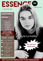
 Development of Contents page
The contents page was more complex to design than the front cover. This is because there is more information placed on the contents. The purpose of this is that it's one of the first pages of the magazine, so the contents needs to engage the reader, otherwise, the audience will not want to read the magazine. So, i have included the important and key information on this page of which the magazine consists of.
The main headline was created using the 'Type tool' on photoshop and selecting the font 'Aeroplane sky', which i downloaded from 'Dafont'. I then increased the size using the size adjustment tool, changing it to '60', so that it would stand out and be the biggest text on the contents page.
Below the main title, i used the phrase 'Contents' to identity the page. Making it in the font 'Starfish', which is cursive and relates to the creative theme of the magazine, being fashion.
Next, i dragged the JPEG logo image into photoshop and used the 'magnetic lasso' tool to select around the area and paste it onto the A4 international paper sized layer which i made to create the portrait page for the contents.
After this, i added the date the magazine was published next to the main title. This was to show the audience the magazine new and up to date.
The index consists of many background colours which i created using the 'shape rectangular tool' and the 'fill tool', to select the colour that worked best for the shape and with the rest of the colours on the contents page. I made the main colour for highlighting information in a 'maroon red' shade, as this contrasts with the light colours on the page. Furthermore, it meant i could white typography for the text in the index as well. Again, contrasting with other colours on the page.
The background colour of the contents is the same as the background colour of the front cover. This makes both pages connect together.
i have used bullets for important information on the contents page. This is because it is the key information used in articles and stories in the magazine. So, it alerts the reader of this. These were created using the 'circular shape tool' and the 'fill tool' of the colour 'white'
Other features like the banner was made using the 'fill tool' and the 'rectangular tool', which i fitted to the shape i wanted. In this case, long and thin. I used white text using the 'type tool' and the 'size tool' to resize the text to a smaller size. As i did not want the banner take up a lot of space. Seen as though, this would make the contents page look unprofessional and inappropriate.
The puff was created using 'Microsoft powerpoint'. Mainly, using the tool, 'shape'. This meant i could create a spikey 'puff' that would capture the audience's attention, rather than using the circular tool on photoshop like the front cover. This would create more of an impact when thinking of 'eye catching techniques.
Finally, the main image was dragged into photoshop from the file ' favourites', which i made of the best images from my photoshoot. I edited the photo in black and white using the black and white filter tool, increasing 'brightness and contrast levels' from the adjustments tools. Then using the 'magnetic lasso tool', i selected around the models figure and selected, 'edit copy' on the same layer. Then 'edit, paste' on the A4 international paper sized layer where my design was being made. Afterwards, using the 'Free Transform tool' and holding down the button on the mac key board, 'shift', i resized the image until i felt it looked in the correct position at the correct size.
I decided to swap the image layer with the title layer. Meaning the image layer was above the title layer. The purpose of this, is to make the image have a '3D affect', making a positive impact on the contents page.
No comments:
Post a Comment