Monday, 28 November 2016

Flat plan for 4 pages of magazine


Front cover...

To the left is my finished flat plan for my fashion magazine front cover. I have chosen this layout because it allows the front cover to look spacious and not over crowded. The sell lines are columned along each side of the main image, to enable the main image to be a focus of the magazine but the sell lines still capture attention. I plan to make the sell lines fascinating, using different fonts and shades of colour that contrast with the rest of the magazine colour. Allowing all features on the front cover to stand out. As well as this, i have extra features on the front cover, such as, barcode, issue number and price. This is in order to make the front cover look as professional and realistic as i can. The banner is also classed as an extra feature, as it will include extra information of features included inside the magazine and persuade the audience to reads the magazine.


As Reflection of magazine front cover... 


Audience Characteristics


Tuesday, 22 November 2016

Comment on tools used and how recreation has helped me

The software Photoshop has enabled me to create a recreation of a billboard and magazine. The tools that helped me do this were mainly the 'edit copy, edit paste' tool, the 'free transformation' tool, 'font' tool ( Type tool), the colour chart tool and the 'magnetic lasso tool'.

Using an international paper sized layer and rotating it 90 degrees clockwise, I was able to create a 'Billboard' style design. To make the recreation look official and in the style of the official billboard i was recreating.The images i used were taken from Google images and i selected images, considering my target audience.

As for the recreation of the magazine cover, again, i created an international paper sized layer. Although, i didn't rotate is as a magazine cover is portrait. When choosing an image i picked a celebrity of my genre and experimented with the use of font, captions and quotes as well as colour on the front page. This has supported my skills for media products by allowing me to practice techniques on photoshop and develop my skills.

Character Drawings


Using Photoshop, i have created a character drawing of my potential audience ( aged 18-25 year old females). The tools i used for this was the Paint bucket tool, magnetic lasso tool, brush tool and colour chart. This allowed me to create a character like person. I have chosen this girl as she links to my target audience and the idea of 'fashion'. The clothing she is wearing represents fashion and therefore she is passionate for fashion ( relating to audience).


Audience moodboard

To the left is a moodpboard of the genre of audience i intend to target for my 'Fashion product'. The age i plan to target is around 18-25 year old young women. This is because many fashion magazines have a 'mature' style to them. Such as 'Vogue'. We notice the models used are around this age as well. So, the target audience is mainly of this genre. There are more female fashion magazines in the Fashion industry than male magazines. Therefore, i felt picking a female audience was best because i could do more research around female magazines, websites and billboards. The key to fashion is the clothing the model wearing being unique and the character the model has. We see the first image on the moodboard shows too girls pulling expressions. This expresses character and we tend to find these type of people are interested in 'Fashion' as it is exciting. The other images focus more on the fashion it's self and how 'feminine' is shown within the clothing. As wells the idea of 'Unique'.

How this Research has pacifically helped my ideas and the codes and conventions i will challenge now

The research into Deconstructions has opened me up to the purpose and reasoning for pacific features in media products. I feel i am now confident with the terminology of the features included in a magazine, Billboard and website and why they are used. Allowing me to become more confident in designing my own product of a Billboard, Website and magazine. I will challenge the features in a positive way, increasing their outlook towards the target audience. By making the Fashion product as Unique as i can. Therefore, it has an identity. This is they key to fashion products appealing to the audience. 'Remembering' the colour scheme and title.

Comment on how similar products has helped me develop ideas

I feel that my research into similar products has developed positive thoughts for my media product and has guided me in the right direction for an Official Fashion themed outcome. I now know the difference between regional magazines in the local area and National magazines throughout the UK and that features are presented a lot stronger in National magazines, as they target a larger range of audience. Conventions have supported me in knowing what to include in the product, such as font style, image use, colour and many more positive features of a media product. Finally, the competition post has helped me think of the purpose of my outcome and how i can make it appeal to the target audience. Reaching to the standards of official Fashion companies.

Competition

The competition for the Magazine, Billboard and Website i plan to create will be official Fashion companies such as Vogue, Elle, Bazaar, Gucci, Channel etc...

There are many fashion brands which i would be competing against, in order for my media product to stand out against theres, below are a few links of companies which i will be competing against...

http://www.vogue.co.uk

http://www.elleuk.com

http://www.harpersbazaar.com

http://www.hearst.co.uk

http://www.glamourmagazine.co.uk

http://www.stylist.co.uk/fashion

http://www.chanel.com/en_GB/?WT.srch=1&WT.mc_id=CO_UK%20-%20Corporate%20-%20Brand%20-%20Pure%20Brand_UK_Google&WT.mc_t=sea&gclid=CjwKEAiA9s_BBRCL3ZKWsfblgS8SJACbST7DcpgCM_bCaao6lQNh6CzANbtRSjuOLD9o_4RUwB4mjBoCaFXw_wcB

https://www.gucci.com/uk/en_gb/?gclid=CjwKEAiA9s_BBRCL3ZKWsfblgS8SJACbST7D0cu6ByrjD34mhmsvpjH4-qad6Oq_MpqLV8gsLst_3RoC17jw_wcB&gclsrc=aw.ds&dclid=CKu7z43YvNACFVKs7Qodi3oCKA

The links above are of particular Fashion web pages that have a magazine and Billboard as well and target a 'young female audience'. This is the reason i would be competing against these companies because they target the same audience of the same genre. Therefore, the features i use on my outcome will be similar to these fashion companies. They all aim to be Unique and therefore,  they all try to achieve the same thing in the media industry. I want to make my fashion product similar to these. However, i want mine to have more of a unique outlook than these, to make it as successful as i can.

Here are a few features in which i will be competing with for my media product...

Colour...

Colour is important because it creates either a positive or negative contrast. The colour scheme usually identifies the type of fashion company that has published it. For example, the fashion company, 'Jack wills' uses the colour scheme of 'Pink and Navy'. Therefore the audience can recognise that the brand it 'Jack wills'. 

http://www.jackwills.com


Title...

The title is the first feature to capture the audience's attention so it needs to be eye catching and unique so the audience can remember it. The title focuses around the style of typography used and the size, shape and form of it. For instance, if we take the example of a fashion Brand name, such as 'Topshop', It engages the audience instantly because of its large scale.


Image Use...

The use of image needs to be a range of shots. such as, close ups, long shots and mid shots that show experimentation of different angles. The images are mainly of the models for the company and therefore, they need to be able to look the part and play the role of a model. Referring to the idea of props and makeup.Plus, CGI ( Computer generated image) is often used to show these different shots taken. Here is an example of model images from 'Dior'...


Coursework planner


September is the starting point for my coursework. Here is where I introduce my Blog page to the audience and give them a pitch, Brief, reflection and Welcome note. This should be completed by the end of September. Giving me roughly 10 days to Begin the first Label. As 'Home' should be the simplest area of my Blog.


October's first media lesson is October 3rd. At this point i plan to start the table, 'Inspirations'. I will give myself 3 weeks to do this label as there is a lot of blog posts i need to consider writing, such as research, ideas etc...After this i will make a start of 'Similar products'. I will need less time to do this label because there are less blog posts to create.
I will give myself 2 and half weeks to complete drafts and then on Friday 11th November i will start to create posts under the label 'Deconstructions'. This will take about 2 weeks if i keep up with the blog posts i need to create. Come the 25th November, I intend to begin the label, 'Drafts'. This will shows screen shots of my progress and knowledge of the media product (fashion theme) i plan to create. The screen shots will represent any initial ideas i have started and then made changes towards the final outcomes.


In December, i am coming to the end of my coursework posts and want to start focusing on the actual product ( Billboard, magazine and website). This means i am not falling behind when i come back to college after the christmas Holidays in January 2017.


In January 2017 i will have finished my coursework and be moving onto the last and final parts of my A2 blog. Including, Posts of flat plans, Starting the final evaluation questions and posting the final media product. I intend to think carefully of how i will answer the evaluation questions , as these are an important section of my overall mark and grade. So, i will give myself a good week and a half to complete this, working  on them everyday throughout the calendar days.


Monday, 21 November 2016

Comment on how inspiration has helped me develop ideas

The inspiration i have included in my blog supports my thoughts and ideas because i have looked into official products and developed knowledge in national products like 'Vogue' and 'Elle'. Moreover,  these have supported my thoughts for style of image, typography/font, captions, quotes, language and colour schemes. Therefore, i can create a product that enables me to relate my theme of magazine to the target audience, in order to engage them.

WIX Template research

http://www.wix.com/website/templates

Wix Template is an online web page maker. You can select the design you want to use for your web page and then start the process of creating your web page. This is a quick and easy method for making a web page for your media product. When designing my web pages, i will use a 'WIX' template to design it. In my opinion, using a template allows my product to look more official and professional, rather than creating you own website from scratch on a software, such as photoshop. The template, allows the layout to look more realistic. You are able to change color, typography, text and add images to the template. Below is the process of which tools i used to add changes to the template and add my own ideas...

 
To begin with, once you have made your account on 'WIX', the first stage of creating your template is by selecting the theme of product you are designing. To the left are the options you can select. therefore, you would select the option closest to the style of web page you plan to design. For me, the best option would be 'Designer'. This is because the style of web page would be creative and unique.


After selecting the option, 'designer', i was able to search for the style of template i wished for. so, this was more accurate for finding a template to suit my theme o 'fashion'. I scrolled down through each template, to finally finding the correct template that i thought worked well for my 'Fashion' theme.


Some useful tools for editing the template on WIX...


These tools are useful as they enable you to alter the navigation style, the button design on the web page and the color scheme of the background. So, you can completely transform the template into your own design. Also, you can drag and drop image into the image templates given, within the features of the web page. Moreover, these changes are quick and easy and support your outcome of your final web page design.

Facial expression research Millum and Ferguson


Millum and Ferguson focus on gender facial expressions. Such as male and female. These facial expressions are what would appear on the front cover of a magazine or media product. The expressions and have names such as, 'chocolate box' and 'carefree'. In addition, Millum and Ferguson recognize the expressions that are presented in image used for media products. The facial expressions have meaning and purpose to engage the target audience, wether that be male or female.

Ferguson
 Ferguson looks into the facial expressions of female models and targets an audience of the female genre. Although, this isn't always the case. For example, the expression, 'Chocolate box' is smiling without teeth and the expression 'Romantic' is used to attract oppersite genders. The expression is flirtatious and appeals to males if the model is female. Other expressions of female models include Invitational, which is similar to 'Romantic' is engages the male audience by using emphasis of the eyes, to create an attraction.

Millum

Millum focuses more on the facial expressions of Male models. The names of the expressions used are; 'carefree', this is to describe a facial expression that shows confidence. 'Practical' describes an expression on daily basis. As for 'Seductive', it describes a slight smile. This is used on many media products to make the model look pleasant. 'Comic' is an expression that is exaggerated. This is most likely to be seen in fashion magazines as facial expressions are over the top and are unique because 'Fashion' is a big part of the model industry. Finally, 'Catalogue' is a neutral look that is used in less popular fashion products. so this may not be used in magazines that are regional and will be used in national magazines.


Friday, 18 November 2016

Inspiring Websites- 'Bazaar' magazine website

Bazaar Magazine Website...
http://www.harpersbazaar.co.uk


Main Features...
.Title
. Drop down list
. Image use
. Font style
. Colour tone

Bazaar magazine is a popular National magazine in the UK, that has a theme of 'fashion'. I find it inspiring because the Title is eye catching when glancing at the web page due to it's large scale. Also, i feel the title gives off the idea of 'Confidence' because it is so big and stands out so much. i think the name of the magazine is unique, which makes it link to the idea of it being unique.

The drop down list, again is similar to 'ELLE' magazine's web page. However, Bazaar's drop down list uses oppersite colours. For instance, a light background and dark font is used on ELLE's website. Whereas, a dark background and light font is used in this web page. Therefore, the 2 websites contrast.

Images used are focused around props and the model's of Bazaar magazine. This is a way of advertising the fashion accessories and giving the audience an idea of the theme of the magazine ( fashion). 

The font style is creative and allows the magazine web page to be recognized. Also, it is in upper case font, which enables it to stand out and capture the audience's attention. 

Inspiring websites- Elle magazine

Elle Magazine website....
http://www.elle.com


Main features...
. Title
. Drop down list
. Image use
. CGI ( computer generated image)
. Font styles ( Typography)/ Quotations and captions
. Colour tone
. Search tool


I am inspired by ELLE magazine's web page because there are pacific features used, which allow it to engage the audience. The list above shows the main features of the web page. 

To begin with, the 'Title' is unique and captures the audience's attention instantly because it is bold and the style of font used is creative. This allows the identification of the fashion company to be represented. Giving readers something to remember this by. Furthermore, a drop down list is made on the web page, to enable the target audience to select the area of the website they want to visit. We can notice this in the three lines listed next to 'Fashion, Beauty, culture, Life and love and Horoscopes'. These are also presented as a drop down list allowing you to select the area of the topic you would like to view. Although, the three lines will list more drop down list style features.

Next, the 'Image use' in the web page is widely experimented with. This makes the target audience age range an important idea. The images include young models that show the page is targeted to a younger audience. Considering the costume and props the models use and how their body language is brought across. The composition of the shots show us this. alternatively, we can notice the audience through just glancing at the web page because of it's colour use and many other features.

'CGI' ( computer generated image) is not noticed in the image but the link to the web page will show that the images change, almost like a slideshow. This allows all areas of the website to be advertised and it a persuasive technique to engage the audience.

As for the use of 'Font styles', there are many unique styles used. It is easily noticed that there are many upper case font styles used for important information in on the website. This is the information the reader should notice first. This is mainly used for captions that include persuasive language and use language such as alliteration and metaphors. 

Colour tone in the web page is contrasting and uses light and dark tones, allowing important details to stand out. The colours used target a 'female audience'. As there are light pink tones. Giving the audience an impression that the magazine is for young females. We notice this in the use of images as well as all the models used are females. Black font is used quite a lot which is fascinating because it's simple yet it contrasts really well with the background colours.

Finally, the search tool is an easier way of accessing areas on the website. By searching for the feature, all the information that relates to this will appear. In my opinion, the search tool is useful and is a quick method for frequent viewers and audience of 'ELLE'


Monday, 14 November 2016

Research into surveys


I plan to look into surveys and research into my target audience genre ( young adults) opinions, on pacific fashion magazines. such as Elle, Vogue, Glamour and more magazines in this genre and wether the target audience are satisfied with the product or not. This will give me an idea of how I can design my product and take inspiration from official products...


Magazine survey results for my targeted genre (young adults)...

Above is an example of Survey results which a female audience has completed. The survey consists of results that the target audience have read within the last 12 months. We can see that 645 people have completed this survey and the most read fashion magazine is 'In style'. Followed by ' The Oprah magazine' (music magazine). Then 'Vogue magazine'( fashion magazine). This result is based on 2016. 


VOGUE MAGAZINE TARGET AUDIENCE VOTE ( TWITTER- SOCIAL MEDIA)...


We can notice that in this vote, the target audience is voted as 'everyone'. The reason behind this could be because 'Vogue' is such a big part of the fashion industry. Also, vogue has a unique style of fashion that seems to appeal to the younger generation of audience and we can notice the votes have came from young twitter users. So, in this case, this is vogue's target audience.


Different themed magazines preference vote...


This result shows us that the vote from the younger genre of audience have voted their favorite style of magazine as being 'Fashion' and 'Beauty'. Therefore, we can recognize the votes have came from a female audience. This result also represents how popular fashion magazines are and how successful they are. The 'Beauty' magazine idea s ver much like the 'Fashion' magazine. As 'beauty' can be a feature of 'fashion'.


Generic conventions of magazine, Billboard and website


Above are the simple conventions use in the media product i intend to design. There are other conventions such as barcodes, puffs and banners that are used as conventions. Although, these aren't nescesarily used in all three media products. Mainly, these are included in the magazine.

Monday, 7 November 2016

Costume, hair and props

Below, is a simple guide from 'vogue' of the main things that stand out in fashion to the target   audience.

Makeup- The makeup used on the model represents the mood the magazine is trying to give. For instance, if the model is wearing bright eyeshadow like blue, green or red, it gives off a positive mood and an exciting atmosphere towards the audience. It also represents an element of 'creativity', as the style of makeup is usually unique and gives a hidden identity/ disguise theme.
Costume- The costume worn by the model is usually a dress if the model is targeting a female audience and is female themselves. Furthermore, some magazines, use male and female models. So, the style of costume can change depending on the gender of the model.
 Shoes- Surprisingly, the first thing the audience notice in a fashion magazine image of a model, is their shoes. This is if the image has been taken as a long shot. The reason for this is that a long shot shoes the everything about the model, including costume. Whereas, a close up shot would not  show this. As it focuses more on the facial expressions. The shoes are usually unique and refer to fashion. So, they can be out of the ordinary.
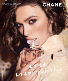
Props- Props tend to be used to advertise the likes of fragrance adverts. For example, the model would be holding a perfume bottle to advertise it. So, props would be used on a billboard. On the other hand, props in magazine photoshoots are used like scarfs, hats and sunglasses. This is just an extra feature and form of advertising fashion products.


collage of front cover, contents, advert and article images


I've created a collage using Photoshop that consists of jpeg images of inspiring front covers, contents pages and advertisements. These images include basic features such as colour tone, texture, fascinating poses and facial expressions that make them look unique. In addition, there is contrasting affects made by the use of lighting and shadows created. The reason i selected these images from the internet was because they consist of a different range of body languages. As for contents pages and front covers, the typography and font used is interesting. Moreover, there is an artistic theme to the background of some images.This expresses the idea of 'creativity'. I plan to consider this collage when designing my product because it will support me with the use of image and layout.