 To begin with, to the left is an example of a facial expression and pose which a model has performed. I like this pose because it allows the audience to get the impression that they are targeted in the magazine. We can notice that the model is a young female, so in this case, the target audience for the magazine this image was presented on would be for young adults. mainly between the ages of 17-25. Pacifically, females. The idea of the image being in black and white, shows editing techniques have been used, in order to make a higher level of contrast in the image. The allows it to look of higher quality as well. The shot has been taken as a mid-shot. This allows the costume the model is wearing to be noticed, so we can realize the image refers to 'fashion'. Plus, it shows the audience the facial expression of the model, referring to the idea of 'Beauty' in the fashion idustry.
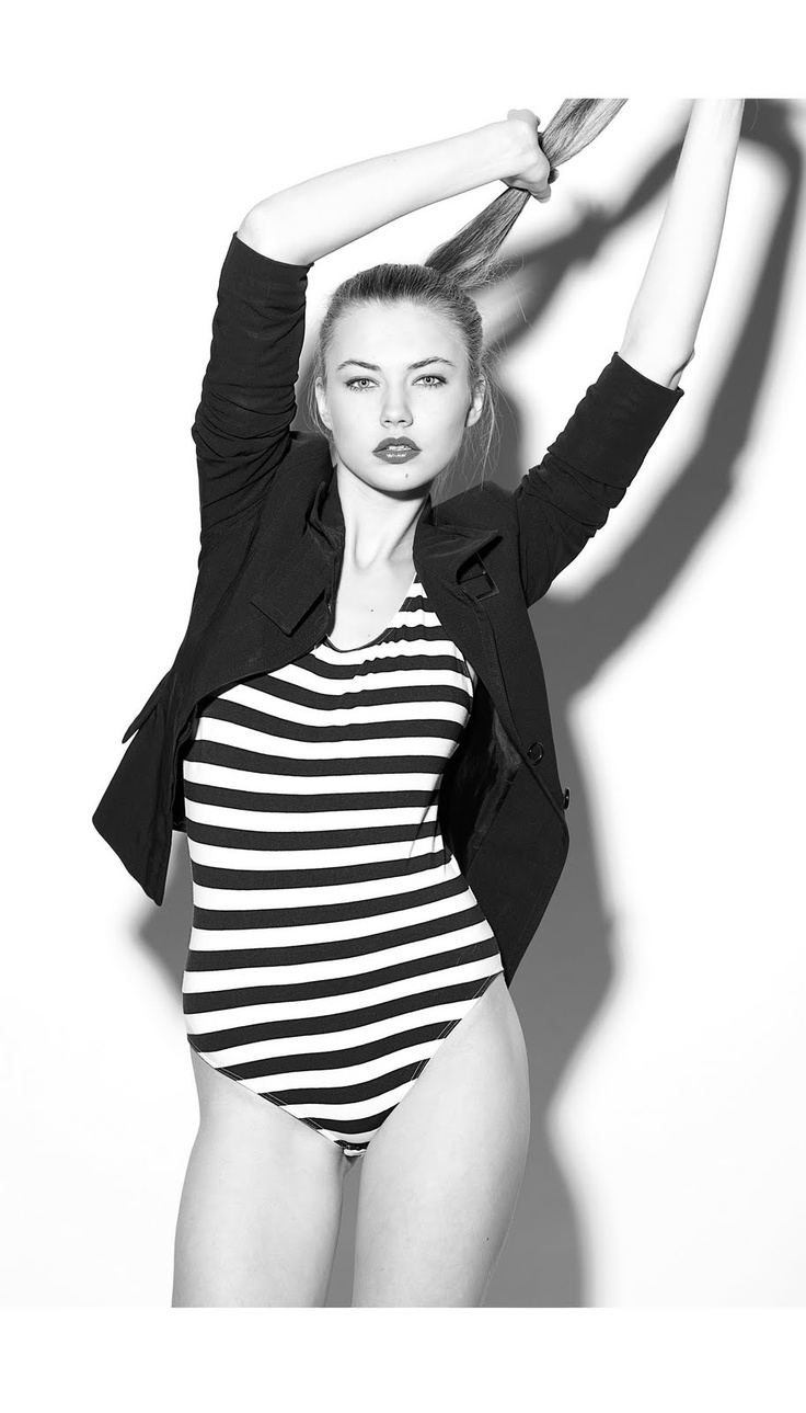 In this image from a model photoshoot, the pose used is unique. Many fashion products, including magazines, websites and billboards, use this style of pose because it enables a unique style of photo to be created. Therefore, the audience can remember the image as it is different to other fashion companies photographs. This is a way of being remembered and 'standing out' in the industry. For instance, companies such as 'Vogue' and 'Elle' use this to promote their fashion title.
As for the type of shot that has been taken, we can see that it has been taken as a long shot. The reason for this is so that costume and body shape can be noticed. As the company is promoting 'Fashion'.
Most of the time, you would tend to find this style of image on a double page spread of a magazine or on a front cover. there isn't many accessories worn by the model in the photo. The outcome of this, may be that the image would not be used on a website or a billboard. as it may not advertise 'fashion' as much as another image.
 This photograph is slightly different to the model photos above. Mainly because the image has been kept in colour. This allows sot tones and textures to be created, making the image look of a high standard. in addition, the pose used in the photo is unique and allows the audience to notice this. as for props used, the idea of using a 'panda', creates a totally different image that other fashion companies would not plan to use when photographing their model's.There is a connection with the costume worn by the model and the colour of the panda being 'black and white'. This shows us that the main focus of the image is the the 'black and white' idea. Linking strongly with the top the model is wearing. So, it allows the costume to be promoted when the audience glances at this image.
The pose allows shadows to be created on the wall in the background. It also gives off the thought of the model being 'confident'. In this case, it makes fashion look confident as well.


