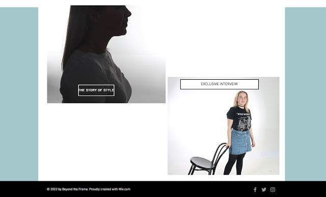
I decided to alter the colour scheme of my background for my final magazine product. The reason for this, is because i feel the features stand out more and create a stronger contrast. Allowing features to be the main focus. I felt the background colour did not look as appealing as using a simple white background. This shows that the use of a white background shows simplicity but it enables a professional affect to be given off...
The contents page...
The contents page has been changed, in that i have changed the colour scheme of the background again and made sure the contents index, isn't overcrowded. Personally, i felt there was too much information in the index. Therefore, i decided to add a small quote and further information below. This allows the reader to feel engaged. Too much information would draw them away from the magazine.
The Double Page spread...
As for the double page spread, The background matches the colour scheme of the magazine and i have changed the colour of some text and the banner block colour. As i feel this colour is the used receptively throughout my magazine and links it together. It also allows features to connect like the 'costa' logo, text and the fill colour of the banner. In addition, i have removed some features on the magazine that looked unprofessional like the user name and social media advertisement. This looked clutter on the page, as there wasn't much space for it. Although, i have kept the logos for the social media advertisement, so it can still be recognised. Increasing the scale of logos in the regional area of the 'North East'. Such as, the Cineworld logo and costa logo. Finally, i changed the large quote, 'Bethany Coyles' ( The model's name) to a more faded pink shade. Connecting to my target audience of young females. As they like this colour. As well as the fact that the shade shows experimentation of colour tone. selecting colours that are close together in my double page spread.
The Billboard...
As for the billboard, i decided to change the typography colour to white, as it connects to my magazine product and website. As well as colour in my logo. Before the shade was a pale green, linking to my previous background. I have also decided to change the exposure of the 'Regional background image', to black and white. This creates a positive affect because it contrasts both modern coloured image ( The model image) and traditional image ( The black and white background image). Allowing a technique to be used that expresses the thought of 'Creativity', linking to my theme of fashion being creative.
In my opinion, these changes have created a positive affect on my final product. This is because color tone can be more of a main focus. As well as contrast. In addition, the conventions used on the product are able to become more eye catching. Linking to real media products and regional and national products that capture the audience's attention.
The website...
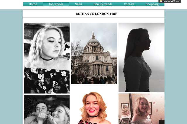
Using images from Bethany's Facebook page ( The Model). I used a variety of different images on the 'Top stories' page, The images are high in contrasting colours and show different colour tones within each image. I have added quotes and the title, 'Bethany's London trip'. This title is simple. Although it explains the story behind the images. this page is fascinating because it experiments mainly with image use and the uses location images as well as portrait images.
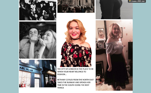
The colors used are traditional and modern, allowing the 2 to look positive against each other. I also like how the images are taken on different locations that connect to the story. Such as, the image of London and the Micheal Kors store image in London. This is evidence that the model has visited here and almost comes across as an image journal.
The layout of page 2 of my website is fascinating, as it is in the style of a college and allows all photographs to be a main focus of the page. The colors used in the images are stronger than the background color scheme of the web page.
At the bottom of the page, i have included some text that discuss briefly, what the images are about. Using emotive language, such as, the metaphor, 'When your heart belongs to fashion'. Representing the dedication the model has to fashion.
Overall, i like this page because it's complex, although there is some simplicity to it, in that it doesn't use a lot of text. In addition, the font is upper case and bold. so, it catches the audiences attention, as much as the images used.
'Home Page'...
http://melissapricex.wixsite.com/mysite


'Top stories page'...
https://melissapricex.wixsite.com/mysite


No comments:
Post a Comment