 Development of website page 2 ( Top stories)
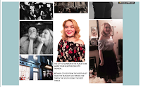
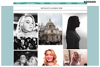
To begin with, the 2nd page of my website includes mostly the use of imagery. the reason for this is because i wanted to create a 'storyboard' idea of the actual main story, being, 'Bethany's fashion trip to London'. I feel creating a moodboard/ storyboard of images enables the 'creative' idea of 'fashion' to be expressed. therefore, i have thought carefully about how i can emerge the creative idea into my web pages.
The images are taken of both location and portraits of the model. So, i have experimented with different images with unique compositions. The images are all taken, using different angles, such as mid shots, close ups etc...Plus, they have different colour tones and filters to them. So, they create a positive contrasting affect. using both colored images and black and white. As well as using photography techniques. Such as, 'low key' lighting in the photograph to create the 'Silhouette' affect made. Although, the audience can recognize this is a portrait of the model because of the structure of the silhouette. Contrast is given against the websites background colour ( pale blue). Therefore, both image and background stand out.
The regional idea is given, although the story is about a trip to London. This clearly stated in the small paragraph of text in between the images at the bottom of the page. It states, " Bethany Coyles from the North East". Therefore, they can still notice the website is from the regional company of 'Essence'. However, the story is about a National Trip.
The web page is almost a photo journal, as the images are of the trip, rather than model images. This connects to the idea of regional magazines/ web pages. They tend to be more 'natural' in the style of pose. Whereas, National products are more aimed to be centre of attention. Although, i used amore serious image for my home page, as it engages the audience due to the eye contact made.
I have experimented with different background shades and images layouts. the reason for this, was so i could find the best colour tones that would contrast and represent creativeness. As well as this, before i dragged the images into 'WIX', I added filters and edited the images in photoshop to make them more sharp, bold and of a higher quality. An example of this is changing the image into black and white.
I am pleased with my overall outcome for my 2nd page of my website. This is because it is simple, yet complex, in that it uses a lot of images and less text. This is a way of persuading the audeince to look at the rest of the website because it doesn't have a lot of text, which they have to read. Plus, the genre of audience i am aiming my web page at is of a young generation, so they would prefer to look at imagery, rather than read a lot of text.
No comments:
Post a Comment