Friday, 13 January 2017

Audience Feedback


  Audience group chat- social Media
                          (Facebook)


To the left is a chat made, using Facebook where feedback   was gathered about what people enjoy doing in their spare time. This means, the features included on the media product can relates to the hobbies people enjoy doing in their spare time. In addition, the people in this chat are all females, which relates to my target audience genre. Therefore, the feedback is useful for magazine, website and   billboard ideas.

Pacific places are mentioned, which means they can be identified in the magazine, by using the likes of a logo or a quotation that advertises the place. Furthermore, seen as though my product is regional. The places mentioned are all in the area of the north east. therefore, this can support my knowledge for my target audience.


Here i have made a chat with another person with the age genre of my target audience. I intend to interview them and ask a few questions about what they think will work well for my media product.


I made a college using photoshop of the 4 images i like best for a double page spread. I will consider the audience's response of which number image they like best.

The response from this person was that they liked the first image best. I plan to ask more people about this and create a survey of which they think looks the most effective.


I moved on from this by asking more people of the same audience genre which image they liked best for a double page spread, 1,2,3 or 4...

here is my Facebook post and the responses i got...


Image 1 and 4 were evenlly most popular. Therefore, will decide from here which image i plan to use for my Double page spread. This is basically the decision of wether i want to use a close up image or a long shot image. Personally, i find image 1 will work best because my other shots in my magazine are more close up's. So, in this case, i can experiment with different shots of image in my media product. Moreover, image in image 1, we can notice the chair ( prop) more clearly. My other images do not use props as such, so this is a stronger image to use.

props and costume


 Choker Necklace, skirt, t shirt


Research into 'Dafont'


The website 'Dafont', is an online 'Type' website that allows you download different styles of text. Ranging from cursive typography to bold/ intense typography. Moreover, you are able to download the fonts to the 'Mac' software and then install them into photoshop. Therefore, you can use new type styles instead of using Photoshop's ready made fonts. Below is the stages of downloading a font style from 'Dafont'...


By selecting download on a font style, it will transfer to the web download, drop down list at the top of safari...


Selecting this, will open the font in the downloads area of the 'finder'.


Lastly, the font will be listed as a PNG image, a TTF and a RTF. Selecting the TTF and then clicking, 'Install', will allow you to open the font in Photoshop. So, next time photoshop is used, the font will be on the drop down list.

https://www.youtube.com/watch?v=1LW-eQTG23A


Tuesday, 10 January 2017

Photoshop useful tools

Using 'Prezi'...

https://prezi.com/ctofwwgqyygu/useful-photoshop-tools/

Costume and Props

When arranging to photograph my model for my media product, I used pacific costume and props to make the photographs connect to my theme of my product- 'Fashion'.

To start with, i told them to turn up to the photoshoot in a fashion style manner. so, in this i instructed them to wear a skirt, t shirt and choker necklace. The reason for the Choker necklace, was that it is relevant and connect the my fashion theme. so, it is a form of advertisement, if i were to use the image on the front cover, contents or double page spread.

Makeup is another thing i told my model to turn up in. The reason for this is because my magazine is targeted to a young female audience. Therefore, it will engage the audience as young females tend to wear makeup.

I did not use any props for my photoshoot. Although, i used a chair in the photography studio and shooted some photographs. So, I could have a variety of photo styles the are different.

Monday, 9 January 2017

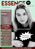
Development of Contents page

                     Development of Contents page

The contents page was more complex to design than the front cover. This is because there is more information placed on the contents. The purpose of this is that it's one of the first pages of the magazine, so the contents needs to engage the reader, otherwise, the audience will not want to read the magazine. So, i have included the important and key information on this page of which the magazine consists of.

The main headline was created using the 'Type tool' on photoshop and selecting the font 'Aeroplane sky', which i downloaded from 'Dafont'. I then increased the size using the size adjustment tool, changing it to '60', so that it would stand out and be the biggest text on the contents page.

Below the main title, i used the phrase 'Contents' to identity the page. Making it in the font 'Starfish', which is cursive and relates to the creative theme of the magazine, being fashion.

Next, i dragged the JPEG logo image into photoshop and used the 'magnetic lasso' tool to select around the area and paste it onto the A4 international paper sized layer which i made to create the portrait page for the contents.

After this, i added the date the magazine was published next to the main title. This was to show the audience the magazine new and up to date.

The index consists of many background colours which i created using the 'shape rectangular tool' and the 'fill tool', to select the colour that worked best for the shape and with the rest of the colours on the contents page. I made the main colour for highlighting information in a 'maroon red' shade, as this contrasts with the light colours on the page. Furthermore, it meant i could white typography for the text in the index as well. Again, contrasting with other colours on the page.

The background colour of the contents is the same as the background colour of the front cover. This makes both pages connect together.

i have used bullets for important information on the contents page. This is because it is the key information used in articles and stories in the magazine. So, it alerts the reader of this. These were created using the 'circular shape tool' and the 'fill tool' of the colour 'white'

Other features like the banner was made using the 'fill tool' and the 'rectangular tool', which i fitted to the shape i wanted. In this case, long and thin. I used white text using the 'type tool' and the 'size tool' to resize the text to a smaller size. As i did not want the banner take up a lot of space. Seen as though, this would make the contents page look unprofessional and inappropriate.

The puff was created using 'Microsoft powerpoint'. Mainly, using the tool, 'shape'. This meant i could create a spikey 'puff' that would capture the audience's attention, rather than using the circular tool on photoshop like the front cover. This would create more of an impact when thinking of 'eye catching techniques.

Finally, the main image was dragged into photoshop from the file ' favourites', which i made of the best images from my photoshoot. I edited the photo in black and white using the black and white filter tool, increasing 'brightness and contrast levels' from the adjustments tools. Then using the 'magnetic lasso tool', i selected around the models figure and selected, 'edit copy' on the same layer. Then 'edit, paste' on the A4 international paper sized layer where my design was being made. Afterwards, using the 'Free Transform tool' and holding down the button on the mac key board, 'shift', i resized the image until i felt it looked in the correct position at the correct size.

I decided to swap the image layer with the title layer. Meaning the image layer was above the title layer. The purpose of this, is to make the image have a '3D affect', making a positive impact on the contents page.

January 2017

As January has approached, i am just about finished my Magazine product leaving me a little time to create my Billboard and website page. I have till February to finish my coursework and personally, i feel i can complete this if i continue to work on my blog and media product frequently. Making sure i do work outside of college as well as in college lessons. Therefore, i can keep up to date with my work and get more things done. Leaving me more time to concentrate on finishing touches to my blog.