Monday, 9 January 2017

Location

I photographed my images for my product through the use of the Sunderland, Bede college studio in the VPA ( visual performing arts) building. 

I organised this through my photography lecture who gave me a time in which i could use the studio and contacting one of my friends in my Photography class, Bethany Coyles, who is a passionate person for fashion. 

With the use of social media and Facebook messenger, i contacted them by leaving them a message, asking them if they would like to model for my media project of a magazine, Billboard and Web page. They responded instantly with a yes and i then gave them a date and time, in which i would photograph them.

The studio was booked out for October 12th 2016 at 2PM. The day before i photographed my model, i contacted them, again, through Facebook messenger and asked them to wear a skirt, shirt and choker necklace. As well as more makeup than usual. This is so that i could take decent photographs that would suit my magazine theme of 'fashion'. When the day came, it took around about 1 hour to photograph them, giving me a range of different styles of images with unique shots and poses. Including, close up shots, Long shots and mid shots. Therefore, i could have a range of image styles to use in my media product. 

The studio was set up as high key with a soft box, trigger and canon camera i could photograph with. as well as studio light to the left and right of the model. The outcome of this, was that my model was central and the lighting would hit them in the right places, to get the best high key photographs with no shadows occurring.

From taking these images, i moved onto creating contact sheets, in which i could select the images i thought worked best from looking them all on 1/2 sheets. Then i moved onto discussing the reasons for selecting pacific images on blogger.


The contents page


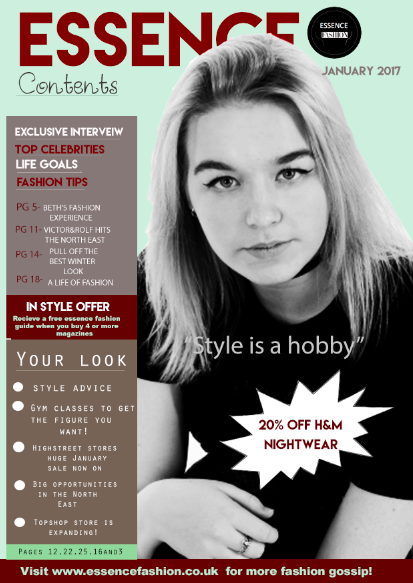
This is the final outcome for my contents page. I feel it has many contrasting affects through the use of colour and textures.

To begin with, I have used a black and white main image, i done this using a 'filter' on photoshop. Then gradually increasing the brightness and contrast levels, as well as darkening darker areas and lightning whiter colours, using the 'curves' and 'levels' tool. This idea of using black and white against coloured features, allows the magazine contents page to look both modern and traditional, allowing opposites to be created.

As for the main title, i have used a deep red font colour, connecting to the other features on the magazine. As well as a bold, upper case font, to represent and make the title eye catching.

Again, i have included the logo on the contents page, for the audience to recognise and to identity the magazine brand. The date notifies the reader that the magazine is up to date. This is something i have made repetitive, as i used it on my front cover.

The styles of fonts i have experimented with is wide. Using the website 'Dafont' to download the fonts into Photoshop. I downloaded the styles, 'Starfish', which i used for the word 'Contents'. This added a creative affect to the page, expressing the creativeness of the theme 'Fashion'. It also added a cursive and unique font, different to the others used.

The index includes many features and stories within the magazine and gives the reader an indication of what the magazine is about. moreover, The features of the index, include, offers, tips and stories of fashion, that may attract and engage the reader into reading the magazine. I have also added the page numbers of the stories and index features because this makes an easy access for the reader to flick to the page they want to read, rather than reading the whole magazine until they get to it. In addition, the colours i have used as a background for the index, are the colours grey and brown, this is because it contrasts with the background colour/ fill colour of the contents page. I used the colour shade, 'Maroon red' to highlight the more important information, in which, i wanted the audience to notice first.

Moreover, i chose to use the dame background colour for my contents page as i used for my front cover. This is because when pages are put together they look connected and are relative to each other. So, the audience can recognise the pages are from the same magazine and look professional.

The puff advertises discount on the fashion store, 'H&M'. This is an important source of information. So, in this case, i decided to use an eye grabbing feature for it. Using an upper case font style to grab attention.

In the banner at the bottom of the page, i have added the web address, which is an extra source of advertising for my magazine brand. I used a banner on the front cover as well and i i find this feature quite professional and it adds quality to the contents design. The typography contrasts with the deep red banner colour. So, it stands out and is noticeable.

Lastly, i have included the quotation, " Style is a hobby". This is a form of persuasive language as it is a quote which i will use in my double page spread article. So, it gives the audience an insight of the article inside the magazine. The language is brought across using a metaphor, as 'style' isn't a hobby. Although, using this term, makes the magazine exciting and fascinating. as well as unique.

Overall, i am happy with my contents page, as it gives a lot of information. However, it doesn't look overcrowded. So, i have thought in depth about the design of the page. I will continue onto my double page spread and consider colour tone, contrast, imagery, quotation and language, to make it appealing to the audience i am targeting my magazine to ( young females).

Contents page flat plan

 To the left is the flat plan i have decided to use for my Fashion magazine, 'Essence' contents page. I created this using the software, 'Microsoft Powerpoint' to create the layout given. The reason for using this style of layout for my contents page, is that the page looks official and reflects what a professional magazine contents page would look like.

Another reason, i picked this layout was because it keeps everything in an organised manner, so that it is easy for the target audience to locate where particular features are. I done this by including features such as a main image, index, banner, puff, date and logo.

To start with, the main title takes up a lot of the space. This is because it is a feature the audience should instantly recognise.

Next, the index including information of stories and features within the magazine, is located to the left of the page, this is to keep it separate from the bigger quotes and text on the page, such as the quote/ sell line and the puff.

The banner will include the web address and emphasis to show the audience this is important, so i will create a red banner, as it stands out using a light font inside, to contrast the colours. The web address will be advertised using persuasive language towards the target audience.

The main image is large, to show the main model of the magazine and to give the audience an indication of who the article and stories in the magazine is mainly about. Plus, to show a different pose and shot of the model.

As for the purpose for using a 'Puff' on my contents page is to advertise something and the star/ spike frame is a technique for capturing the audience's attention because it's eye-catching, so it is important.

Finally the date and logo at the top of the page just reminds the audience that the magazine is up to date and is the of the brand 'essence', relating back to the front cover page.

I plan to follow this layout the best i can for my magazine, opening the JPEG image of it in photoshop and continuously reflecting my contents page back to it, in order for it to relate well.

Original Flat plan for front cover


Original Flat plan for front cover of magazine


 New flat plan for front cover of    magazine

original ideas for front cover of magazine


When designing my front cover for my fashion magazine, i experimented a few times with different fonts styles and coloured/ filled backgrounds, using photoshop.


To start with, i chose to design my front cover using a 'black and white colour scheme'. The reason for this, is because it represents editing techniques. however, i found the magazine would have more of an impact using the main image in colour and increasing brightness and contrast levels. as well as this, colour tone would stand out more using a colored main image.

Next, i decided started to design a magazine cover using the same image in colour and using a pale grey background/ fill colour. Therefore, i could use light colored font and dark coloured font with this background shade, as it is a colour that would allow my typography colour to be flexible. i downloaded the font, 'Starfish' from 'Dafont' and used it for my title. When using it on the front cover, i noticed the font was very cursive and did not look very bold and intense. the first thing that captures the audience's attention is the Title of the magazine, so it needs to be bold and eye-catching. As well as this, seen as though the font was cursive, i thought this may be difficult for some readers to see and read. So, i changed it to a more bold and intense font style.

I then moved onto choosing a pale green colour scheme for the background, rather than grey because i found this worked better, giving the cover a little bit of colour and creating a stronger contrast with the text on the page. This colour also relates to my target audience. Pale green is a popular female colour when it comes to fashion and it is connected to all types of female, wether they are very lady like or not so lady like.


Sunday, 8 January 2017

Chosen image


The circled image is my chosen image for my front cover of my fashion magazine.The reason for choosing this is because the composition of the image is interesting as it is a close up. It allows the model to connect with the audience through eye contact and engages them into reading the magazine.


 I plan to edit this image in photoshop by increasing contrast levels, curves levels and brightness levels, using the software, Photoshop. i will place this image on a A4 international paper sized layer, which is portrait and is the best size and layout for my Magazine cover. I will experiment with filters such as black and white, to see the outcome and alter any changes like deleting layers if i feel this doesn't work well.

Seen as though my magazine is a women's fashion magazine and there is a theme of 'Feminine' to it. i will use the 'patch tool', to erase any marks or dark circles under eyes and on the face. As well as select the area of the nails, using the 'magnetic lasso tool' to create a painted nail affect and make them a colour that links to the front page.

After this, on the A4 international paper sized layer, i will experiment with the shades of background, using the 'fill tool', until i find the correct shade, before adding typography and other features to the page.

contrasting affects on the image will increase the quality and make the image to a high standard, in order for me to gain further marks in my magazine product.

Photoshoot for product

To the left are 2 contact sheets of my photoshoot for my Fashion magazine, using a student from my Photography class. I chose to use this person because i feel she is a good model and is interested in 'fashion' herself. Therefore, she is passionate about being part of my product. In addition, the images are taken in the college photography studio using 'High key' lighting. This means there are no shadows created in the image and they turn out to be bright and sharp.

As for the poses of the model, i decided to instruct them to strike a range of pose. We can see some images are taken standing up and some sitting down. I have also used a chair as a prop and tried to the best of my ability to create a 'fashion' model image, that will engage an audience. Personally, i feel my images are to a high standard quality and look professional because contrast is shown throughout.


Camera settings...

      High key photographs


The setting for high key lighting can vary depending on the camera used when photographing. Above is an image of a canon camera. Displaying it's settings. 

The settings for the best results from high key lighting are...

F-stop- 5.0
Exposure-1/25
ISO-1600


        studio lights and model positioning